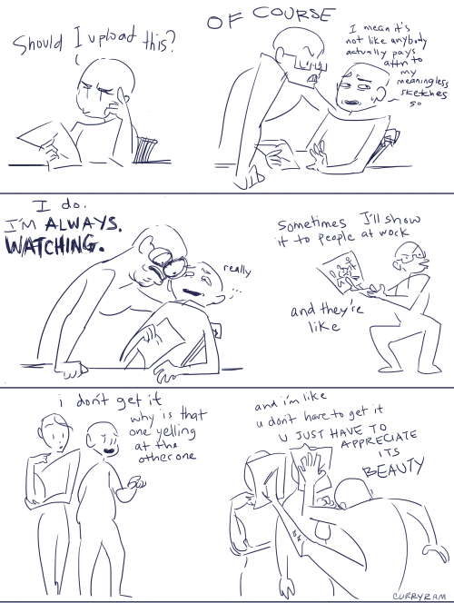
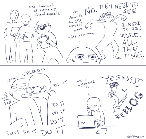
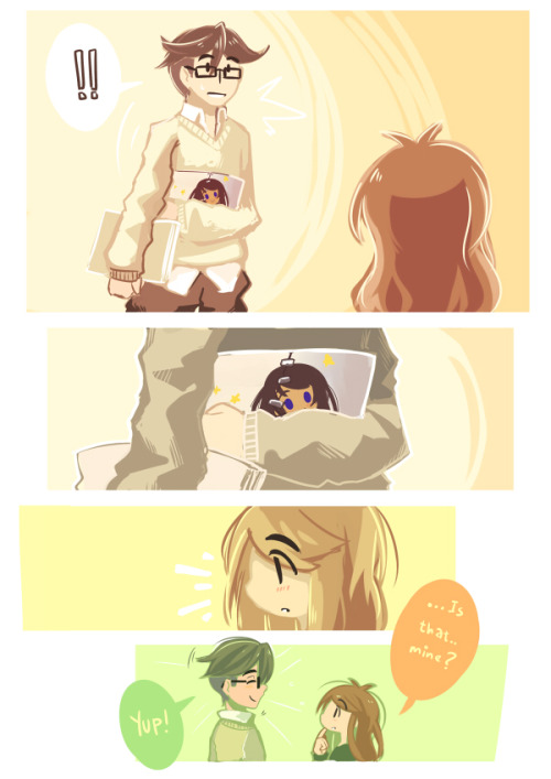
reblogging this because in in a really painful rut right now, and seeing my followers, hearing what you have to say and knowing that i inspire so many of you, it makes me want to keep trying.
remember that no matter how bad you feel? there are people who look up to you! dont worry about popularity, or follower counts, just work at it because YOU want to. there will be people who love it. ❤
Composition is everything! No amount of detail in an illustration or Concept Painting will be successful without a strong composition foundation.
Composition in Environment Concept painting can be quite difficult since your focal point usually isn’t as obvious as in a character piece. In this introduction to Composition we will explore the fundamentals used to create exciting and functional compositions along with a variety of composition techniques. Initially I will show some successful examples of iconic composition, formal composition, the rule of 3rds, the golden rule, etc. There will be a discussion on what makes each piece successful and an explanation on why the artist chose to describe the scene using a particular form of composition.
When you take the canvas area and divide it into ‘thirds’ Horizontally and Vertically, where the lines cross in the picture area is a ‘Golden Mean’, or the best spot in which to place your Main Subject or Object of Interest as it is the Focal Point of your picture. The golden rule originates from the Ancient Greeks, since they were great mathematicians as well as artisans, they came to the conclusion that there needed to be a certain balance in composition for it to be pleasing to the eye. They further developed this theory and defined what they called “power points,” Power points are located at the point where the lines used in the golden rule intersect. By placing a main subject on a power point, it further defined that subject as the focal point.
The golden rule can and usually is applied to a paintings canvas proportions. As you read through the following text you’ll notice that most of the imagery presented utilizes similar dimensions and almost all of them fall into the “golden rectangle.” Today you can find the Golden Rectangle almost everywhere: from credit cards to phone cards to book covers, all are shaped with its proportions. The Golden Ratio (the ratio of the longer and shorter sides of the Golden Rectangle) also appears in many natural phenomena. The ratio between the length of your nose and the distance from the bottom of the chin to the bottom of the nose is the golden ratio. The spiral growth of crustaceans follows the golden spiral. The divine proportions are an in-built (or in-grained) aesthetic parameter we judge beauty by.
The imagery [above] represents the division of space when the “golden rule” is applied to a blank canvas. Basically it is the division of a line in two sections, where the ratio between the smallest section and the largest section is identical to the ratio between the largest section and the entire length of the line. In other words A/B = B/(A+B). The ratio is about 1/1.618. Honestly, I’m still not exactly sure what that all means? but, I do know that I used this grid layout a-lot when I first started painting and found it helpful. I still do.
In the beginning you may find it useful to use this as an overlay for every concept piece you do. Having this grid float over your imagery as a reminder of where to place the objects of importance in the scene may help you as your develop your composition.
From the golden rule came the “rule of thirds” which is virtually the same concept but slightly altered to fit photographic proportions.I find it a bit easier to follow since it’s very simple in its origin.Here we have a look at the rule of thirds in action.
Notice that the main focal point sits right almost directly over one of the “golden means.” Additionally, other objects are placed near the other converging lines (the bird, for example) but, not directly on them, since that would create competition for the focal point.
There are Four Spots where these lines cross the Upper Left the Lower Left, the Upper Right and the Lower Right. Please note that all the “hotspots” are away from the center position in the picture frame.
The two best “power points” are the Upper Right and the Lower Right because the eye enters the picture frame at the lower left hand corner of the picture frame, travels to the center of the picture area and then reaches the right hand ‘Golden Mean’ position where it stops to look at the ‘Center Of Interest’.
The reason the eye enters a picture at the lower left side is because we are taught to read from Left to Right. This is a psychological fact that has been proven over the years. Next time you’re in an art gallery or art museum that shows the Old Masters paintings, notice how many have the Center Of Interest in the “Golden Rule” positions.
‘Implied Forms’ are a combination of ‘Implied Lines’ and they help to hold a painting together. The eye enjoys these interesting forms and will stay in the picture area to examine each one of them, if they are present. The following text and sample imagery will demonstrate a variety of implied forms and composition approaches.
The Circle is made up of a continuous ‘Curve’ and it’s circular movement keeps the eye in the picture frame. There are many circles in nature and man made objects. You can use the circle in a very obvious way in your composition or simply suggest it.
The image [below] is a very obvious and deliberate usage of circular composition. Notice how the circular shapes created by the dragons also follow a path that leads your eye towards the focal point.
Another example of circular composition! Again, I chose this type of composition to enhance the feeling of motion in the piece. You can see how the eye follows the circular shapes across the picture plane to the focal point. Something interesting to note with this image, it actually uses two composition approaches at one time; circular composition and iconic composition.
This has a ‘solid base’ and will show Stability. It also has Height and Strength. The Pyramids of Egypt have survived for thousands of years while other types of solid buildings have crumbled in to dust in less time. With the image below I was very deliberate with my arrangement of shapes so the triangle or pyramid composition is obvious. When I began this piece I simply started with a triangle shape as my starting point…nothing more than an abstract composition. I just let everything flow from there….and very quickly the painting began to take shape.
Is a connection of ‘Lines’ meeting in the Center and an expansion of ‘Lines’ leaving the Center. The Radii is usually found in Nature Subjects. The best example of the man made Radii is the spokes of a wheel.
The eye has two ways to go when it comes upon the Radii. It can either be drawn in to the picture area or it can be led out of the picture area. You must be careful how you used the Radii and try to have the eye led into the picture.
A showing of ‘Opposing Force’ that will give the picture a feeling of Cohesion and Relationship. The horizontal bar of the Cross will act as a “stopper’ while the vertical pole can act as a leading line. The windows in a large skyscraper will form crosses and will keep your interest in the building. The Cross also has religious meaning and the subtle use of the Cross can give hidden significance to an image.
In the painting below Hong Kuang uses the cross composition subtly. One could argue this piece is also using an “L Composition.” The strong line across the horizontal center that’s being formed by the characters body suggests “The Cross.” The somber facial expression and subject matter demonstrate an experienced artist’s ability to use symbolic composition to help tell a narrative.
To the right of that is Daryl Mandryk’s work which successfully combines a Cross composition with iconic composition. This is common composition choice for themes of heroism or comics. Fantasy artists like Brom and Frazetta use this type of composition in their work regularly.
This makes an attractive ‘frame’. It can be used to accentuate important subjects. Many times it is a ‘frame’ within a ‘frame’.
A tree with an overhanging branch at the ‘right’ side of the picture area will form a ‘Rectangle’ and help frame the Main Subject in the picture. By doing this you will make the Center of Interest stand out and be noticed clearly.
Some Art theorists contend that the most important information in the image should be placed near the center of the picture plane. This may seem confusing to some students since this contradicts many of the major principles of the “golden rule.” In general iconic composition should and can be used to describe a subject in a certain way. Iconic Composition or “Formal Subdivision” applies best to subjects of a dignified or religious nature. This style of composition was the approach of choice in earlier times and many excellent compositions have been made with it. Usually Iconic composition is used to describe symbolic subjects, heroic subjects, or religious subjects.
I’ve taken the liberty of drawing over this imagery to demonstrate the division of space in iconic composition. This is a technique used by many illustrators to help define the division of space and focal point when creating an iconic illustration. Well know and renowned illustrator Andrew Loomis used this technique extremely well and his book “Creative Illustration” to demonstrate this further.
Notice, that while the focal point is slightly off center, all the converging lines lead to the center point of interest. Additionally, notice how the figures head sits directly in the diamond shape of the overlay lines I’ve created. It should also be noted that I chose this composition to further enhance the regal and heroic appearance of the character.
Tong Wu uses Iconic composition perfectly here! Notice how the character again falls nearly at center of the canvas. I’ve taken the division of space a bit further on this imagery and have broken down the image into smaller segments so you can so how the artist balances everything in the piece.
Notice how the top right corner is almost a mirror image of the top left corner. In fact, look at almost any opposing segment in the painting, they are very similar! When creating iconic composition, it’s not necessary to duplicate each side exactly, but there should be a feeling of complete equalization of the units or masses, the line and spaces of one side with the other.
So, there you have it, a variety of ways to deal with division of space when you first begin visualizing a painting or drawing. At the end of the day, theses approaches to composition are guides and simply a place to start. Once you become more comfortable with composing a scene you can begin to push the boundaries of formal composition.
Since most Environment Concept Artists work in the entertainment industries, its expected you will be asked to create cinematic moments or “memorable moments” utilizing the environment as a stage.
You’ll want to use your mastery of composition to lead the viewer’s eye and really make the viewer feel like they’re in the scene. The single most important thing you simply must have in any Environment Concept Painting is a clear and dynamic focal point.
Without a place for the viewer’s eye to rest, the painting will lack impact and won’t hold the attention of your audience. It’s the job of the Concept Artist to visualize what can’t be visualized in reality. Concept Artists are the first step in every production and therefore must create dynamic imagery that the rest of the team will be excited to build. There are a few cinematic tricks that you can use as a Concept Artist to make things appear more dynamic.
Sometimes all it takes to add an extra bit of drama to your composition is a simple tilt of the camera. In the image to the right the viewer really feels like they are part of the action, simply by slanting the camera a bit. This approach is especially useful when you are trying to depict action in your environment.
Many Concept Artists today, myself included, use perspective as a tool to create dynamic compositions that appear to have motion and lead the eye to the focal point clearly and concisely.
In the painting below you will notice I’ve used many of the objects that appear in the painting as opportunities to further guide the viewer to the “payoff.” Additionally, I tilted the camera a bit to add to the action.
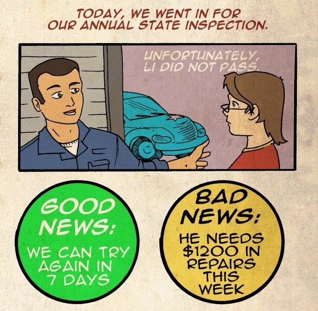
for those of you unaware, I spent an entire month in the hospital, and this has set me back in funds exponentially and its getting harder and harder to buy basic necessities like food and hygiene products, not to mention bills. and Im in need of serious help, so Im changing up my commissions a little, same prices as before, just upping it from busts to half body:
$10 for a grayscale
$15 for a full color
$5 each for extra characters
I really need help and anything, even a reblog, will help, so please spread this, and if your interested in commissioning me hmu via tumblr ask or the new messaging system, thank you
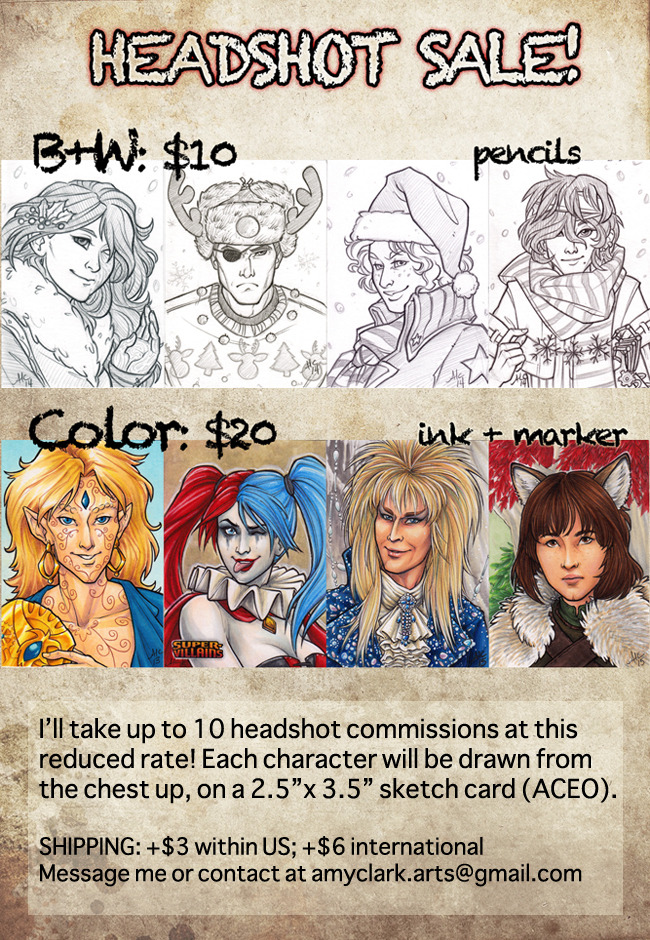
Trying to raise a bit of money, so I’m doing a headshot sketch card sale!
I’ll take up to 10 headshot commissions. $10 for one pencil lineart headshot, and $20 for one fully colored headshot. One character per card, sized at 2.5″ x 3.5″ – standard ACEO/PSC dimensions. Original characters or fanart, it’s all good with me as long as you can provide reference for me to work from!
Payment will be via Paypal in US$. I will require a mailing address if you want the physical card mailed to you.
Feel free to contact me through tumblr, facebook, DA, or my email at amyclark.arts@gmail.com
Drawing can’t always be fun. Sometimes you gotta hunker down and draw like a crazy person all alone in solitary confinement. Turn on music, a documentary or something that won’t need much of your vision since you’ll be drawing. Or podcasts. Sometimes you got to mentally chain yourself to the table and do something you don’t want to do. And backgrounds are quite the chore, it’s gonna be hard work.
“Drawing can’t always be fun.”
Once you accept this truth, see your productivity skyrocket! Artists who struggle to get going are always searching for inspiration, or motivation, but the key is actually… RESIGNATION.
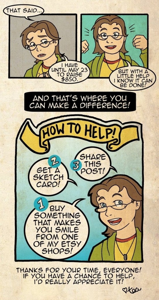
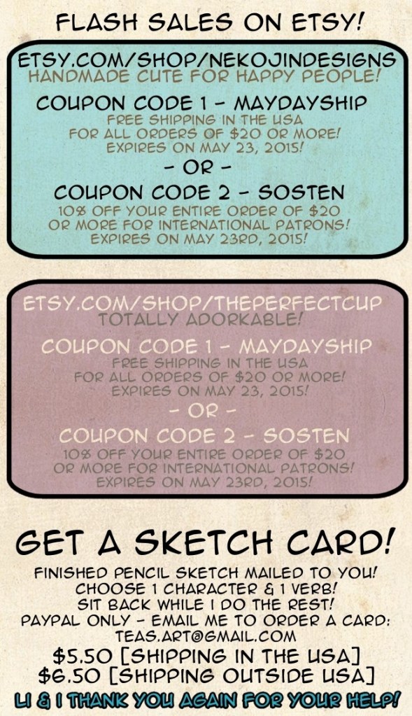
I know we don’t really know each other, but can you help? Do you know someone who might be interested in helping? Have you been meaning to pick up a few things frommy etsy shop? Or even my other shop? Now is your chance.
Thank you, sincerely, for your time.
♥ tea
Looking at your art has been so inspiring. I’ve been having a very hard time lately because I feel like a lot of my artistic peers around me have been improving their skills exponentially and I’ve just stayed in the same place. I’m worried that artists who are 19 going on 20 like me and are aiming to be apart of the art production team for professional companies are suppose to be sooooo far ahead in their skills and it makes me feel like I’m very behind and it’s too late to have dreams of working for Disney or Pixar or Dreamworks or wherever. Because of my lack of faith in my skills I also chose to go to a regular university instead of one that specializes in art of animation or illustration. You are probably very busy, but I just had this sudden urge to reach out and ask for advice. If you only have time to look at this, that’s fine, and I want to say thank you for creating such beautifully creative, expressive, and fun drawings that can be enjoyed by anyone.
(I received this question in my inbox today and I had to really think about it. It hit home personally, so please forgive the wall of text!)
First point I gotta make right out of the gate is: never let another artist’s progress affect what you do, or how you feel. Your artistic evolution is your own path, and others have no direct correlation to your value as an artist, or as a person.
It’s natural to place mental yard sticks for measuring your progress against artists surrounding you (and this isn’t made any easier by the advent of social media in art), but in reality it can be extremely toxic. Instead of dreading the work of others as you see them progress, celebrate it. Really look at what you like about what they did, take what you love, try it yourself, make it your own. That’s how we grow as a community, and as individuals.
Second point I really have to stress is: Screw big studio dreams. Don’t get me wrong, I know it’s awesome to have a goal to work at one of the big houses. I know amazing people who work at places all over the industry, but you know what I find? Everyone starts, at some point or another, looking outward at different places to work again. Studio culture changes as people leave, are laid off, or simply move on to challenge themselves elsewhere. Regardless of your dreams, you should always be striving to love what you do, and constantly pushing to work at places where you can surround yourself with awesome people who support & challenge your artistic growth. That CAN be at a place like Disney, Pixar or DreamWorks…but it’s just as likely to happen in small teams and studios.
Point three! Art school is bogus in many degrees. Each campus is paranoid and comparing itself to another (or just CalArts and Art Center), but what we all tend to forget is that these up-and-coming, talk of the town artists graduating from these institutions are not examples of the student body as a whole. There are hundreds of artists graduating from ‘prestigious’ institutions that never get seen or talked about while they attend, and their work is good. There are people who drop out too! And there is nothing wrong with that. Dropping out does not equate to failure. Often times it means they had the guts to admit that that school wasn’t the path for them. I can’t tell you how many professional, successful industry artists I’ve met who either A) never went to an art college, or B) dropped out and never graduated.
My point is, school is an opportunity, but it by no means is the only way to succeed. At the end of the day the only thing that’s going to provide you the opportunities you need to be successful and fulfilled…is yourself.
I can talk about these things all day because I’m in the same boat honestly. I constantly doubt myself, dislike my work and question if I should even bother. I’m by no means a professional. I’ve been looking for work for about 7 months now, and I can get really down in the dumps. But I also have to remember that it’s a tough time for the industry, and everyone, even pros, are hurting. We’re lucky that this is a community that, if anything good can be said about it, is amazing at supporting its members. We look out for each other, and we all deal with the same struggles. Screw expectations. Keep trying to get better because it’s what you love to do. Others will see that passion & effort in your work and it will carry you further than you ever hoped.