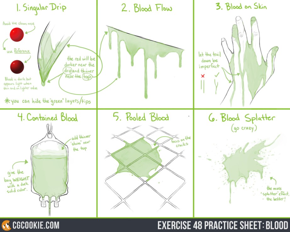
Check out the Exercise and Download the Practice Sheet HERE.
You know that saying, “blood is thicker than water“, well that applies to drawing it as well! Read the full explanation and tip guide on how to paint blood for your own works. You can download the pratice sheet .PSD in the link above along with both step by step guides!
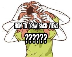
ive been asked a few times how i draw back-views, especially for character sheets so i wanted to share a little trick I learned a while back that’s really really helpful especially if you’re used to drawing things from the front and need help getting the proportions right from the back view.
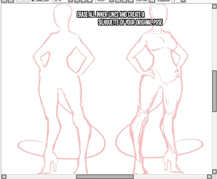
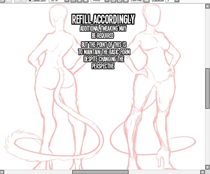
You don’t ALWAYS have to do this the way that I do; The only reason I put effort into the front view is because this is going to be a character sheet and I need the front view to be fleshed out.
But alternatively; Just sketch out a sillhouette, then fill it in on a higher layer.
Sorry if someones already done this before im just answering a frequently asked question ;w;
Drawing basic facial expressions is not the hardest. Most people can draw a sad face, a happy face, angry etc., but making more multidimensional expressions is more of a challenge. I have gotten a lot of compliments on how I draw facial expressions, (specifically “angsty ones”) telling me that they are very dramatic and well… expressive! And there are actually only a few things I think about when I draw faces that take them to the next level, so I thought i’d illustrate them all here!
SUPER IMPORTANT TIP BEFORE WE START: Look at your own face when you draw faces. Even making the face when you are drawing (you don’t even have to look at it), will give you some sense of how the face muscles pull and where things fold and stretch, because you can feel it. You are the best reference when it comes to facial expressions!
Angles
Draw the head in an angle that matches the expressions you want to make. It is not a requirement, but is going to add to the effect.
Symmetry vs asymmetry
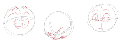
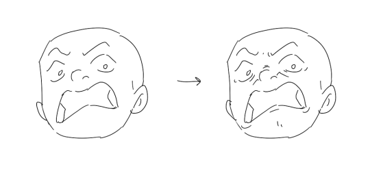
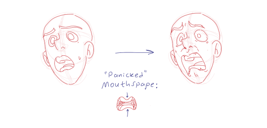
A face is rarely symmetric. Unless the face the character is making is 100 % relaxed or even dissociating, the eyebrows, mouth and facial muscles will have different placements of their respective side. This image shows the dramatic impact asymmetry has on a face:
That’s the difference between a smile and a smirk!
The first one’s like “oh yeah?” and the second is like “oH YEAH??”
The “balloon squishing principle”
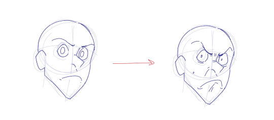
This is something I did subconsciously, and I didn’t know about until I made this tutorial. And this principle goes hand in hand with an asymmetric face. Basically, if you squish one part of the face, you need to even out the empty space by “inflating” the other part of the face so that it doesn’t appear shrunken. The picture hopefully explains it:
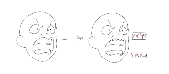
Teeth
Don’t forget to add the gum when the mouth is open to its full potential!
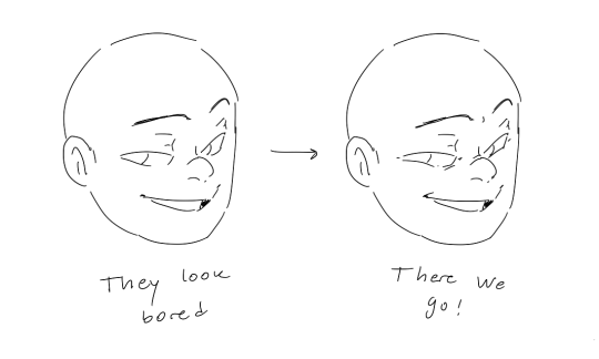
Squinting and folding
Adding folds around the eyes when a character is squinting makes a HUGE difference. It makes a smile more genuine and a growl more intimidating. Adding folds to the face in general makes your characters more lifelike and ‘visually relatable’. Like, they look human, and less plastic or fake.
and so on..
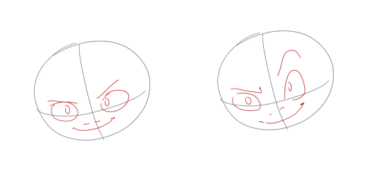
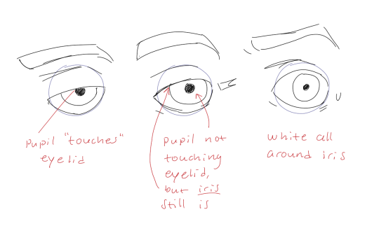
Pupils and irises
The placement of the iris and pupil in relation to the eyelids is very important! The less of the white you see, the more relaxed the character is.
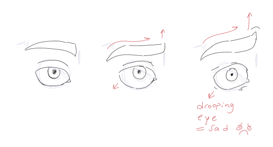
And then of course eyebrows and eyes go hand in hand!
Gestures, spitting, sweating…
Adding more elements than just a face is key to making the character actually look like they are feeling what you want them to feel. Just the tiniest sweat drop adds to their anxiety, spitting adds frustration to their rage, slouching shoulders, waving hands, a double chin, extreme angles, the list goes on! Add whatever and see what kind of impact it makes! Does it do the trick? Great! Add it!
Over exaggeration!!
Remember that you can almost always exaggerate more. Don’t be afraid to do draw “too much” because you’re just experimenting. See what works and what doesn’t. What do you like to exaggerate?
Now that you know some theory, it’s time to practice!
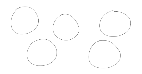
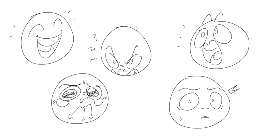
Fill a page with circles and fill them in with different expressions. Try and exaggerate as much as you can!
This is mostly for experimenting. They are quicker to draw than complete faces, but the same rules should apply!
And that’s about it!
I don’t know if I covered everything in this tutorial, since some things might be obvious for me, and this post perhaps only scratches the surface. So feel free to send me a message if you want an explanation about something more in depth! Thank you for reading! And now DRAW!!! ✨🎨
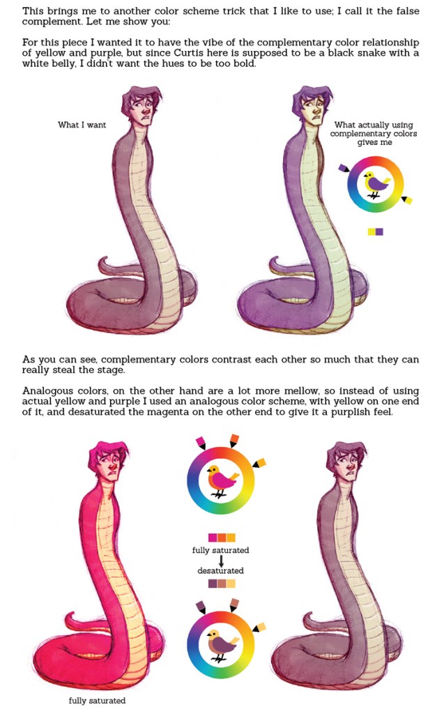
DESATURATED YELLOW LOOKS LIKE GREEN YES MY VISION IS VALIDATED I KEEP SEEING PEOPLE WITH VERY PALE BLONDE-ISH HAIR AS HAVING GREEN HAIR AND PEOPLE KEEP GETTING WEIRDED OUT BY IT BUT NO THAT IS ACTUALLY NOW COLORS WORK Y’ALL JUST HAVE PRECONCEPTIONS OF WHAT COLOR HAIR CAN AND CANNOT BE
anyway this is fantastic and i’m off to go try this out ❤
thank you both for such nice messages, I’m so glad you like my art…!! hopefully I can help at least a little bit!
anon 2) my brush settings can be found here! anon 1) wrinkles can get pretty complex! it depends on the type, weight, thickness, and cut of the fabric, whether the character is in motion, etc; I wish I could get into everything, but it’s a huge subject that I don’t think I could possibly cover…!! but I can at least give you some very very basic tips on building up a dress (and the lace underneath!)
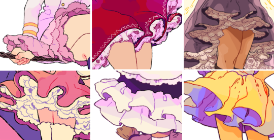
here are some examples of dresses I’ve drawn recently. they might seem complex, but when broken down to their most basic form, they’re actually very simple shapes that follow very similar rules!
are you seeing any patterns between them? while they do differ a bit, they’re by and large made from the same long line that curves into itself and back out. learning where this line goes and how it changes under different circumstances is learned largely through practice and intuition, but there are some steps you can take to begin building a foundation to work from! (or at least to sort of break down the process!)
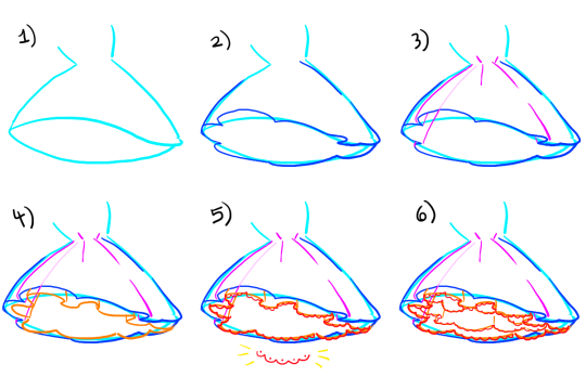
determine the shape/angle of the dress itself.in this example, I’m using a big poofy dress shown from slightly below!
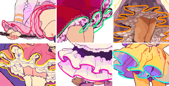
use this as a guide when adding that curving line from before. think of how the fabric folds, and keep in mind that the direction of the curve (and how harsh it appears) depends on where it falls on the dress and the angle at which it’s being viewed from. in this example, it’s more pronounced on the edges, and is facing different directions on the left and the right sides.
wherever cloth folds, wrinkles appear! wrinkles will be more abundant where the cloth is more compact; in this case, that’s toward the waistline. on a dress like this, a fold will originate at the waistline and radiate downward; this means that on an uninterrupted fold, the line that you draw should (if you were to continue it all the way, which is not always necessary) reach cleanly back to the waist. I added one translucent line to help illustrate this idea!
want to add a lace layer? it’s the same concept!! add your basic curving line underneath, keeping in mind that the cloth above will likely mirror whatever it’s falling over. (not perfectly, but somewhat!) so try to keep it a little consistent!
details are easy now!! you can add any sort of lace pattern you want by just tracing over that first line! I used a basic scallop shape here
want even more lace? just repeat step four as many times as you want underneath your last layer of lace!
once you get the hang of this part, figuring out more complex stuff gets much easier! I’m not great at explaining things, but hopefully you were able to come away with some kind of new information, haha…!! I’m wishing you both the best with your art!!!
A really great tutorial on skirt ruffles that I wanted to share with all the artists who follow me! 😀
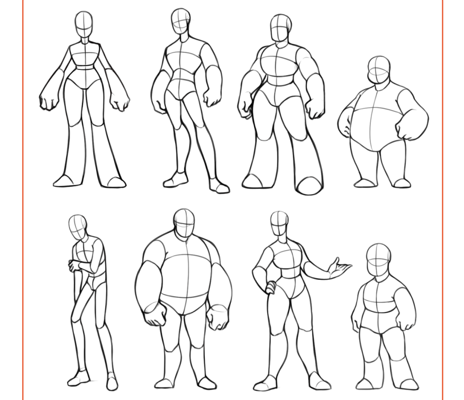
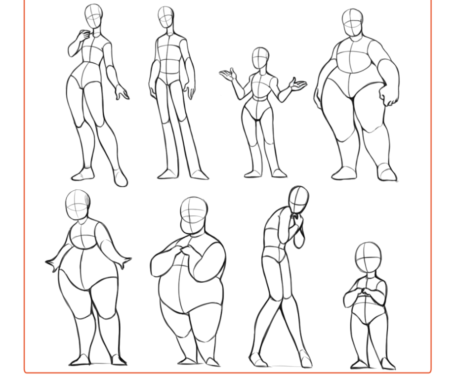
This reference sheet includes 50+ body types for people who struggle in creating unique character bodies. Also I did a mini-breast tutorial, because I didn’t add breasts to any of the body types since breasts are so customizable.
Edit: I added 4 more body types in this preview, since people really enjoyed this reference sheet. I also edited the description of male/female bodies for clearer understanding. Thank you for enjoying my reference sheet, I’m glad this was helpful to many people.
No more melted tomblerones or mising skulls, yyeann!
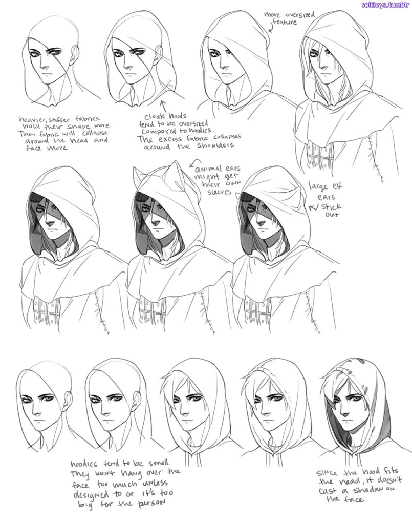
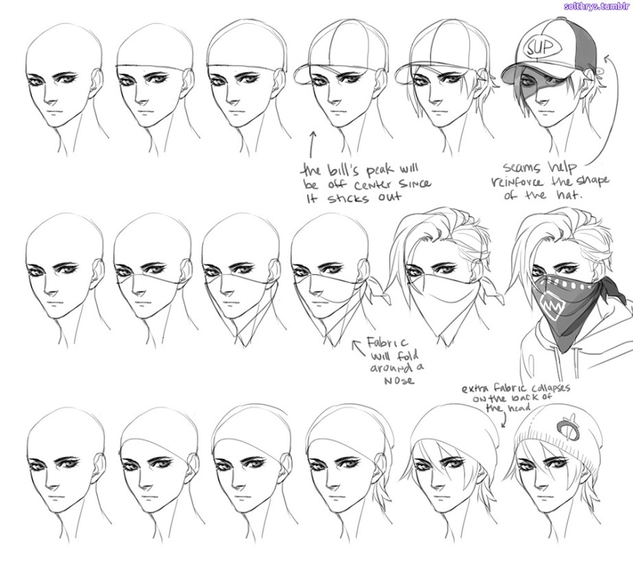
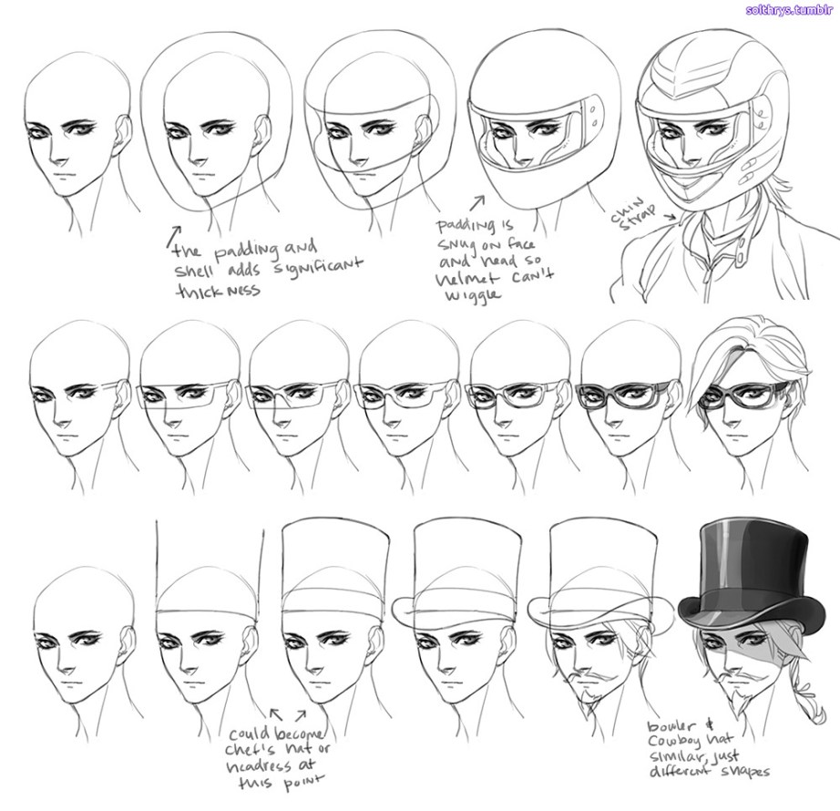
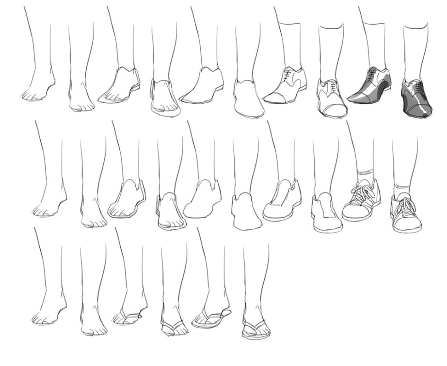
This is my basic process for pretty much everything I draw. The key is understanding the shape of the garment you’re trying to draw and the shape of the body part you’re putting it on.
Drawing the body first forces you to make the shoe, hat, or clothes fit that body. With practice you’ll be able to skip some steps. This method works the same no matter the perspective or pose. It just relies on your knowledge of what a hat looks like from above, or what the bottom of a shoe looks like. When in doubt, just google refs. Don’t necessarily need the exact angle you’re trying to draw. Look at different pics to give you an idea of how it works in 3d.
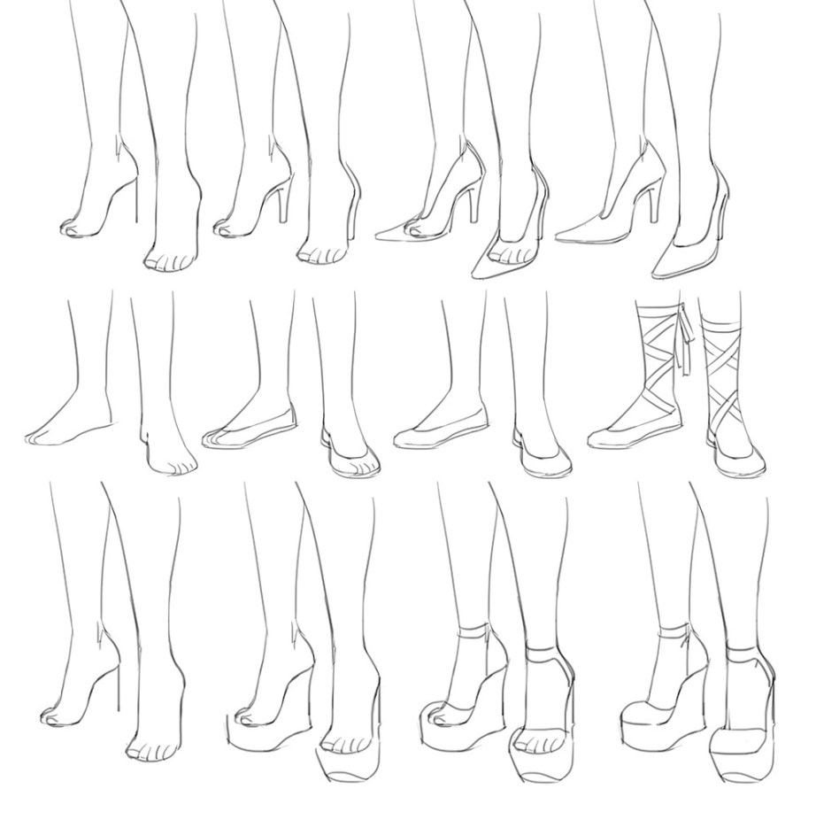
Shoes are always a bit tricky because feet are a stupid ass shape.
It might help if you think of hats as a cylinder fitted to the person’s head to help you get the perspective right before you push in detail. note: heads aren’t circles. they’re kind of egg shaped if you look at them from the top.
Well thank you and I will try my best to explain how I do my magic
The big secret to poses and stuff is to just keep your hand really really loose and flowy. I kinda pretend the body I’m drawing is made up of water and doesn’t really have any bones-once I figure out the pose, THEN I hammer it down with technical work and fine detail.
There’s also the magical and mystical “line of action”
These guys are really important and are a tremendous help out if the drawing your making looks a little stiff. The line of action is basically one giant sweeping line that creates an arc that your characters body can follow. REALLY good for dynamic poses. Speaking of dynamic poses:
Dynamic poses are better achieved if there is perspective thrown into the mix-an upshot a downshot, any way you can change up how the character is facing the “camera” other than directly placed in front of it. Notice how the line of action is pretty much the same, except its volume changes in each drawing.
I also wanna point out that those weird skeleton model Q-Tip thingies do absolutely fuck all for helping with posing and volume construction.
On the left I used the Q-Tip atrocity and on the right I broke the body into shapes and used the spine as a sort of guide/line of action. The Q-Tip drawing got the girl placed into the sketch (basically just putting a “marker” down for where shes gonna be standing) but thats about it. The shapes method helps figuring out the spacing between body parts, defines the line of action easier, and is far less rigid than the Q-Tip method.
The Q-Tip also doesn’t help with proportioning or perspective so unless you can somehow make it work for you I really don’t recommend using that.
As for expressions I kinda already did a post on that HERE but I’ll explain it a little bit more in this post.
Emotions can be simplified into 3 building blocks (I’m not counting fear here as thats technically a primal response to danger and not really an emotion.) Combining said bulding blocks together to create more complex emotions is what gives us good acting in a character. Just keeping them among the 3 blocks is what keeps them stale.
Not only does combining emotions spice up the character acting, but distorting facial features is a big help too-like the shrinking and expanding of the iris for example.
Lastly when creating an expression you wanna use the WHOLE FACE not just the eyes. Involving the nose, the cheeks and the mouth and eyes all at once is what really defines what the character is feeling without the use of words.
I’m really bad at getting my thoughts all together in a coherent fashion so I hope I managed to explain it all okay. What really REALLY REALLY helps is studying people in movies or even watching people in public interacting with each other. Studying from life is the best thing you can do-ESPECIALLY when it comes to poses and anatomy.