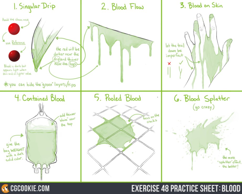
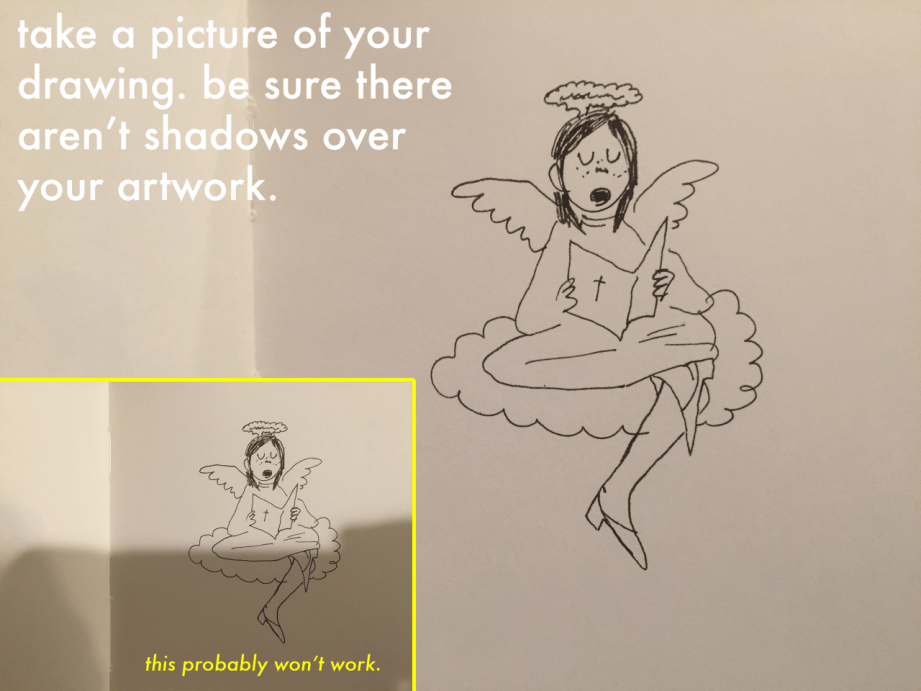
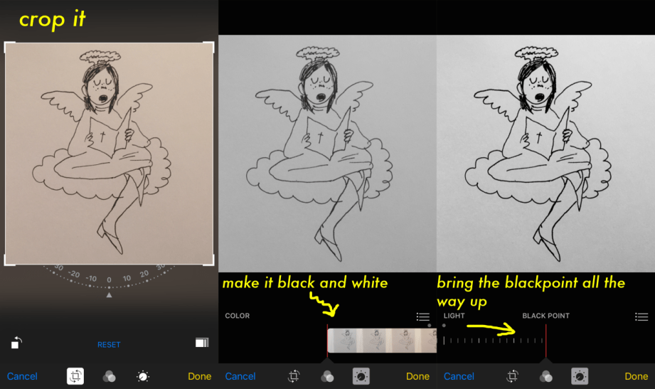
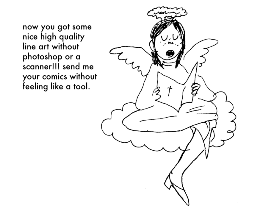
Check out the Exercise and Download the Practice Sheet HERE.
You know that saying, “blood is thicker than water“, well that applies to drawing it as well! Read the full explanation and tip guide on how to paint blood for your own works. You can download the pratice sheet .PSD in the link above along with both step by step guides!
Studying anatomy is fantastic. Whatever you do, don’t stop! I’m going to suggest gestures but that is by no means a suggestion to swap. Just start implementing gestures as well.
Okay. So. Look at this.
This is a still from Glean Keane animating Tarzan – and it exactly nails what a gesture is. Just a few simple lines that are full of movement and you can tell exactly what the heck is going on. All with a few simple lines.
Learning anatomy is great – but learning how to implement it is another thing. If I focus too much on nailing anatomy – the drawing starts to feel stiff, exactly as you’ve stated.
Gestures are all about forgetting what you think you know about muscles and structure and instead drawing what movement in a body FEELS like. That might sound cooky but that’s kind of how I approach it in my head. It’s all about those lines of movement and contrast and CURVES.
I think loosening up and forgetting about how technically correct a drawing is and instead embracing something rough and full of movement, and looking at how the lines in the human body contrast themselves will do you wonders. Keep learning anatomy, but look at how we move and look the weird shapes we can make with our bodies. Look at the way we slouch and stand tall. The way we dance, the way we run. Sit in a coffee shop and try to draw the heart of someone’s pose in like 30 seconds.
Observe MOVEMENT AND RHYTHM AND MY GOD THE HUMAN BODY IS POETRY *GESTICULATES WILDLY*
Even just grabbing a photograph from the net and looking at it objectively – how would this pose break down into a few simple lines? It’s so damn simple to look at something this way. You can endlessly improve your knowledge of anatomy and your technical abilities – but I think so many of us (myself included) stumble at the simplest foundations.
My last suggestion is a wonderful book (videos are floating around on youtube as well) from Mike Mattesi in which he talks about Force. It’s fascinating stuff! I love this example of a simple gesture being built up on.
I hope at least some of that was useful! Just start small okay. Think about learning the chords before you try and master Stairway to Heaven.
Vulgar is a conlang (constructed/fictional language) generator created to help literally generate a language for you. No, really. No tricks, and it’s super simple to use. It’s my favourite tool right now for writing fantasy, even as someone who loves creating his own languages, it’s an amazing starting point.
Want a random conlang, straight away, with no prep or fuss? Just visit http://vulgarlang.com/index.html and click “Generate New Conlang”… and that’s it. Scroll down and through your brand new, generated, completely original conlang.
If you’re a little more advanced in terms of conlanging and want to specify IP phonemes to be used, you can add them too, but even with no knowledge of linguistics you can create a language at the click of your fingers.
This version of Vulgar is completely free, sure…. but! the guy who created it has not only made an amazing thing (which I repeat, is absolutely free at it’s most basic point), but is also planning on updating it more and more!
Under the “Buy” tab on the Vulgar website, he links to his email, where you can offer to pay for the full version of Vulgar, which is a total steal right now at a sale price of only nineteen dollars. Considering professional conlangers and linguists could charge you, like, a metric fuck ton of money for the same data you’re getting here for just nineteen, that’s a major steal.
Not to mention, buying the alpha build now gives you free access to all of it’s updated versions, which I can guarantee are just going to get better and better! I’ve already bought it and I adore it, and this is a tool the likes of which we in the conlang community have never seen in such an awesome way.
Please consider helping Vulgar out, because the creator is a damn genius
yo here’s a useful tip from your fellow art ho cynellis… use google sketchup to create a model of the room/building/town you’re trying to draw… then take a screenshot & use it as a reference! It’s simple & fun!
Sketchup is incredibly helpful. I can’t recommend it enough.
There’s a 3D model warehouse where you can download all kinds of stuff so you don’t have to build everything from scratch.
reblog to save a life
This is an incomplete tutorial, and it drives me crazy every
time I see it come around.
We live in a pretty great digital age and we have access to
a ton of amazing tools that artists in past generations couldn’t even dream of,
but a lot of people look at a cool trick and only learn half of the process of
using it.
Here’s the missing part of this tutorial:
How do you populate your backgrounds?
Well, here’s the answer:
If the focus is the environment, you must show a person in relation to
that environment.
The examples above are great because they show how to use the
software itself, but each one just kind of “plops” the character in front of
their finished product with no regard of the person’s relation to their
environment.
How do you fix this?
Well, here’s the simplest solution:
This is a popular trick used by professional storyboard and
comic artists alike when they’re quickly planning compositions. It’s simple and
it requires you to do some planning before you sit down to crank out that
polished, final version of your work, but it will be the difference between a background
and an environment.
Even if your draftsmanship isn’t that great (like mine),
people can be more immersed in the story you tell if you just make it feel like
there is a world that exists completely separate from the one in which they
currently reside – not just making a backdrop the characters stand in front of.
Your creations live in a unique world, and it is as much a character as
any other member of the cast. Make it as believable as they are.
Great comments and tutorials!
I’m a 3d artist and have been exploring the possibilities of using 3d as reference for 2d poses. I want to add a couple of tips and things!
Sketchup is very useful for environment references, and I assume it’s reasonably easy to learn. If you’re interested in going above and beyond, I highly recommend learning a proper 3d modeling program to help with art, especially because you can very easily populate a scene or location with characters!
Using 3ds Max I can pretty quickly construct an environment for reference. But going beyond that, I can also pose a pretty simple ‘CAT’ armature (known in 3d as a rig) straight into the scene, which can be totally customized, from various limbs, tails, wings, whatever, to proportions, and also can be modeled onto and expanded upon (for an example, you could 3d sculpt a head reference for your character and then attach it to the CAT rig, so you have a reference for complex face angles!)
The armature can also be posed incredibly easily. I know programs exist for stuff like this – Manga Studio, Design Doll – but posing characters in these programs is always an exercise in frustration and very fiddly imo. A simple 3d rig is impossibly easy to pose.
By creating an environment and dropping my character rig into it, I have an excellent point of reference when it comes to drawing the scene!
Not only that, but I can also view the scene from whatever angle I could ever want or need, including the character and their pose/position relative to the environment.
We can even quickly and easily expand this scene to include more characters!
Proper 3d modeling software is immensely powerful, and if you wanted to, you could model a complex environment that occurs regularly in your comic or illustration work (say, a castle interior, or an outdoor forest environment) and populate the scene with as many perspective-grounded characters as you need!
The British Hairdressing Awards, sponsored by Schwarzkopf Professional, celebrates the very best of British hairdressing – recognising and rewarding the creative talents of individuals and teams who make this industry one of which we can all be proud. #Love it!
Composition is everything! No amount of detail in an illustration or Concept Painting will be successful without a strong composition foundation.
Composition in Environment Concept painting can be quite difficult since your focal point usually isn’t as obvious as in a character piece. In this introduction to Composition we will explore the fundamentals used to create exciting and functional compositions along with a variety of composition techniques. Initially I will show some successful examples of iconic composition, formal composition, the rule of 3rds, the golden rule, etc. There will be a discussion on what makes each piece successful and an explanation on why the artist chose to describe the scene using a particular form of composition.
When you take the canvas area and divide it into ‘thirds’ Horizontally and Vertically, where the lines cross in the picture area is a ‘Golden Mean’, or the best spot in which to place your Main Subject or Object of Interest as it is the Focal Point of your picture. The golden rule originates from the Ancient Greeks, since they were great mathematicians as well as artisans, they came to the conclusion that there needed to be a certain balance in composition for it to be pleasing to the eye. They further developed this theory and defined what they called “power points,” Power points are located at the point where the lines used in the golden rule intersect. By placing a main subject on a power point, it further defined that subject as the focal point.
The golden rule can and usually is applied to a paintings canvas proportions. As you read through the following text you’ll notice that most of the imagery presented utilizes similar dimensions and almost all of them fall into the “golden rectangle.” Today you can find the Golden Rectangle almost everywhere: from credit cards to phone cards to book covers, all are shaped with its proportions. The Golden Ratio (the ratio of the longer and shorter sides of the Golden Rectangle) also appears in many natural phenomena. The ratio between the length of your nose and the distance from the bottom of the chin to the bottom of the nose is the golden ratio. The spiral growth of crustaceans follows the golden spiral. The divine proportions are an in-built (or in-grained) aesthetic parameter we judge beauty by.
The imagery [above] represents the division of space when the “golden rule” is applied to a blank canvas. Basically it is the division of a line in two sections, where the ratio between the smallest section and the largest section is identical to the ratio between the largest section and the entire length of the line. In other words A/B = B/(A+B). The ratio is about 1/1.618. Honestly, I’m still not exactly sure what that all means? but, I do know that I used this grid layout a-lot when I first started painting and found it helpful. I still do.
In the beginning you may find it useful to use this as an overlay for every concept piece you do. Having this grid float over your imagery as a reminder of where to place the objects of importance in the scene may help you as your develop your composition.
From the golden rule came the “rule of thirds” which is virtually the same concept but slightly altered to fit photographic proportions.I find it a bit easier to follow since it’s very simple in its origin.Here we have a look at the rule of thirds in action.
Notice that the main focal point sits right almost directly over one of the “golden means.” Additionally, other objects are placed near the other converging lines (the bird, for example) but, not directly on them, since that would create competition for the focal point.
There are Four Spots where these lines cross the Upper Left the Lower Left, the Upper Right and the Lower Right. Please note that all the “hotspots” are away from the center position in the picture frame.
The two best “power points” are the Upper Right and the Lower Right because the eye enters the picture frame at the lower left hand corner of the picture frame, travels to the center of the picture area and then reaches the right hand ‘Golden Mean’ position where it stops to look at the ‘Center Of Interest’.
The reason the eye enters a picture at the lower left side is because we are taught to read from Left to Right. This is a psychological fact that has been proven over the years. Next time you’re in an art gallery or art museum that shows the Old Masters paintings, notice how many have the Center Of Interest in the “Golden Rule” positions.
‘Implied Forms’ are a combination of ‘Implied Lines’ and they help to hold a painting together. The eye enjoys these interesting forms and will stay in the picture area to examine each one of them, if they are present. The following text and sample imagery will demonstrate a variety of implied forms and composition approaches.
The Circle is made up of a continuous ‘Curve’ and it’s circular movement keeps the eye in the picture frame. There are many circles in nature and man made objects. You can use the circle in a very obvious way in your composition or simply suggest it.
The image [below] is a very obvious and deliberate usage of circular composition. Notice how the circular shapes created by the dragons also follow a path that leads your eye towards the focal point.
Another example of circular composition! Again, I chose this type of composition to enhance the feeling of motion in the piece. You can see how the eye follows the circular shapes across the picture plane to the focal point. Something interesting to note with this image, it actually uses two composition approaches at one time; circular composition and iconic composition.
This has a ‘solid base’ and will show Stability. It also has Height and Strength. The Pyramids of Egypt have survived for thousands of years while other types of solid buildings have crumbled in to dust in less time. With the image below I was very deliberate with my arrangement of shapes so the triangle or pyramid composition is obvious. When I began this piece I simply started with a triangle shape as my starting point…nothing more than an abstract composition. I just let everything flow from there….and very quickly the painting began to take shape.
Is a connection of ‘Lines’ meeting in the Center and an expansion of ‘Lines’ leaving the Center. The Radii is usually found in Nature Subjects. The best example of the man made Radii is the spokes of a wheel.
The eye has two ways to go when it comes upon the Radii. It can either be drawn in to the picture area or it can be led out of the picture area. You must be careful how you used the Radii and try to have the eye led into the picture.
A showing of ‘Opposing Force’ that will give the picture a feeling of Cohesion and Relationship. The horizontal bar of the Cross will act as a “stopper’ while the vertical pole can act as a leading line. The windows in a large skyscraper will form crosses and will keep your interest in the building. The Cross also has religious meaning and the subtle use of the Cross can give hidden significance to an image.
In the painting below Hong Kuang uses the cross composition subtly. One could argue this piece is also using an “L Composition.” The strong line across the horizontal center that’s being formed by the characters body suggests “The Cross.” The somber facial expression and subject matter demonstrate an experienced artist’s ability to use symbolic composition to help tell a narrative.
To the right of that is Daryl Mandryk’s work which successfully combines a Cross composition with iconic composition. This is common composition choice for themes of heroism or comics. Fantasy artists like Brom and Frazetta use this type of composition in their work regularly.
This makes an attractive ‘frame’. It can be used to accentuate important subjects. Many times it is a ‘frame’ within a ‘frame’.
A tree with an overhanging branch at the ‘right’ side of the picture area will form a ‘Rectangle’ and help frame the Main Subject in the picture. By doing this you will make the Center of Interest stand out and be noticed clearly.
Some Art theorists contend that the most important information in the image should be placed near the center of the picture plane. This may seem confusing to some students since this contradicts many of the major principles of the “golden rule.” In general iconic composition should and can be used to describe a subject in a certain way. Iconic Composition or “Formal Subdivision” applies best to subjects of a dignified or religious nature. This style of composition was the approach of choice in earlier times and many excellent compositions have been made with it. Usually Iconic composition is used to describe symbolic subjects, heroic subjects, or religious subjects.
I’ve taken the liberty of drawing over this imagery to demonstrate the division of space in iconic composition. This is a technique used by many illustrators to help define the division of space and focal point when creating an iconic illustration. Well know and renowned illustrator Andrew Loomis used this technique extremely well and his book “Creative Illustration” to demonstrate this further.
Notice, that while the focal point is slightly off center, all the converging lines lead to the center point of interest. Additionally, notice how the figures head sits directly in the diamond shape of the overlay lines I’ve created. It should also be noted that I chose this composition to further enhance the regal and heroic appearance of the character.
Tong Wu uses Iconic composition perfectly here! Notice how the character again falls nearly at center of the canvas. I’ve taken the division of space a bit further on this imagery and have broken down the image into smaller segments so you can so how the artist balances everything in the piece.
Notice how the top right corner is almost a mirror image of the top left corner. In fact, look at almost any opposing segment in the painting, they are very similar! When creating iconic composition, it’s not necessary to duplicate each side exactly, but there should be a feeling of complete equalization of the units or masses, the line and spaces of one side with the other.
So, there you have it, a variety of ways to deal with division of space when you first begin visualizing a painting or drawing. At the end of the day, theses approaches to composition are guides and simply a place to start. Once you become more comfortable with composing a scene you can begin to push the boundaries of formal composition.
Since most Environment Concept Artists work in the entertainment industries, its expected you will be asked to create cinematic moments or “memorable moments” utilizing the environment as a stage.
You’ll want to use your mastery of composition to lead the viewer’s eye and really make the viewer feel like they’re in the scene. The single most important thing you simply must have in any Environment Concept Painting is a clear and dynamic focal point.
Without a place for the viewer’s eye to rest, the painting will lack impact and won’t hold the attention of your audience. It’s the job of the Concept Artist to visualize what can’t be visualized in reality. Concept Artists are the first step in every production and therefore must create dynamic imagery that the rest of the team will be excited to build. There are a few cinematic tricks that you can use as a Concept Artist to make things appear more dynamic.
Sometimes all it takes to add an extra bit of drama to your composition is a simple tilt of the camera. In the image to the right the viewer really feels like they are part of the action, simply by slanting the camera a bit. This approach is especially useful when you are trying to depict action in your environment.
Many Concept Artists today, myself included, use perspective as a tool to create dynamic compositions that appear to have motion and lead the eye to the focal point clearly and concisely.
In the painting below you will notice I’ve used many of the objects that appear in the painting as opportunities to further guide the viewer to the “payoff.” Additionally, I tilted the camera a bit to add to the action.
Well thank you and I will try my best to explain how I do my magic
The big secret to poses and stuff is to just keep your hand really really loose and flowy. I kinda pretend the body I’m drawing is made up of water and doesn’t really have any bones-once I figure out the pose, THEN I hammer it down with technical work and fine detail.
There’s also the magical and mystical “line of action”
These guys are really important and are a tremendous help out if the drawing your making looks a little stiff. The line of action is basically one giant sweeping line that creates an arc that your characters body can follow. REALLY good for dynamic poses. Speaking of dynamic poses:
Dynamic poses are better achieved if there is perspective thrown into the mix-an upshot a downshot, any way you can change up how the character is facing the “camera” other than directly placed in front of it. Notice how the line of action is pretty much the same, except its volume changes in each drawing.
I also wanna point out that those weird skeleton model Q-Tip thingies do absolutely fuck all for helping with posing and volume construction.
On the left I used the Q-Tip atrocity and on the right I broke the body into shapes and used the spine as a sort of guide/line of action. The Q-Tip drawing got the girl placed into the sketch (basically just putting a “marker” down for where shes gonna be standing) but thats about it. The shapes method helps figuring out the spacing between body parts, defines the line of action easier, and is far less rigid than the Q-Tip method.
The Q-Tip also doesn’t help with proportioning or perspective so unless you can somehow make it work for you I really don’t recommend using that.
As for expressions I kinda already did a post on that HERE but I’ll explain it a little bit more in this post.
Emotions can be simplified into 3 building blocks (I’m not counting fear here as thats technically a primal response to danger and not really an emotion.) Combining said bulding blocks together to create more complex emotions is what gives us good acting in a character. Just keeping them among the 3 blocks is what keeps them stale.
Not only does combining emotions spice up the character acting, but distorting facial features is a big help too-like the shrinking and expanding of the iris for example.
Lastly when creating an expression you wanna use the WHOLE FACE not just the eyes. Involving the nose, the cheeks and the mouth and eyes all at once is what really defines what the character is feeling without the use of words.
I’m really bad at getting my thoughts all together in a coherent fashion so I hope I managed to explain it all okay. What really REALLY REALLY helps is studying people in movies or even watching people in public interacting with each other. Studying from life is the best thing you can do-ESPECIALLY when it comes to poses and anatomy.